


Vora el Mar
Campaign / Editorial
During the past years, the Maresme coastline has been severely affected by the regression of its shores. The consequences are visible at first glance, with the deterioration of seaside promenadesand the disappearance of most beaches. The current proposals to regenerate the coasts are ineffective and costly, further harming the marine ecosystem.
"Vora el Mar" is an awareness and visibility campaign that highlights the situation experienced by the towns of Maresme. Through an immersive experience, it portrays the past, present, and future of the Catalan coast.


La Identidad Después de la Muerte
Editorial
Identity consists of unique and distinguishing traits that characterize us as individuals. It accompanies us from birth until death, but what happens to our identity once we depart from life?
"La Identitad Después de la Muerte" arises as a reflection on identity design applied to the tombstones. The book compiles the graphic style used in the past and how it has evolved to the present through photographs, in order to highlight the loss of identity due to the trend of serializing tombstones.


La Rosa dels Vents
Lettering / Packaging
La Rosa dels Vents is a project to pay tribute to all the farmers and artisans dedicated to viticulture in Alella. It consists of a collection of three wines (white wine, rosé wine, and red wine) cultivated in the village's vineyards.
Photography by Marti Viñuales @martivinyu

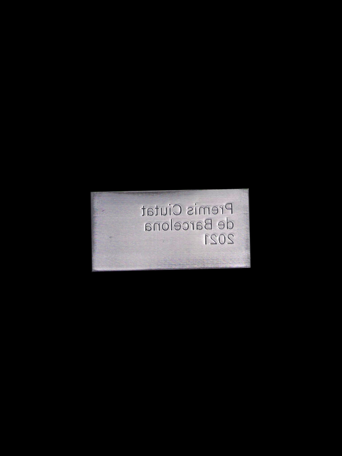


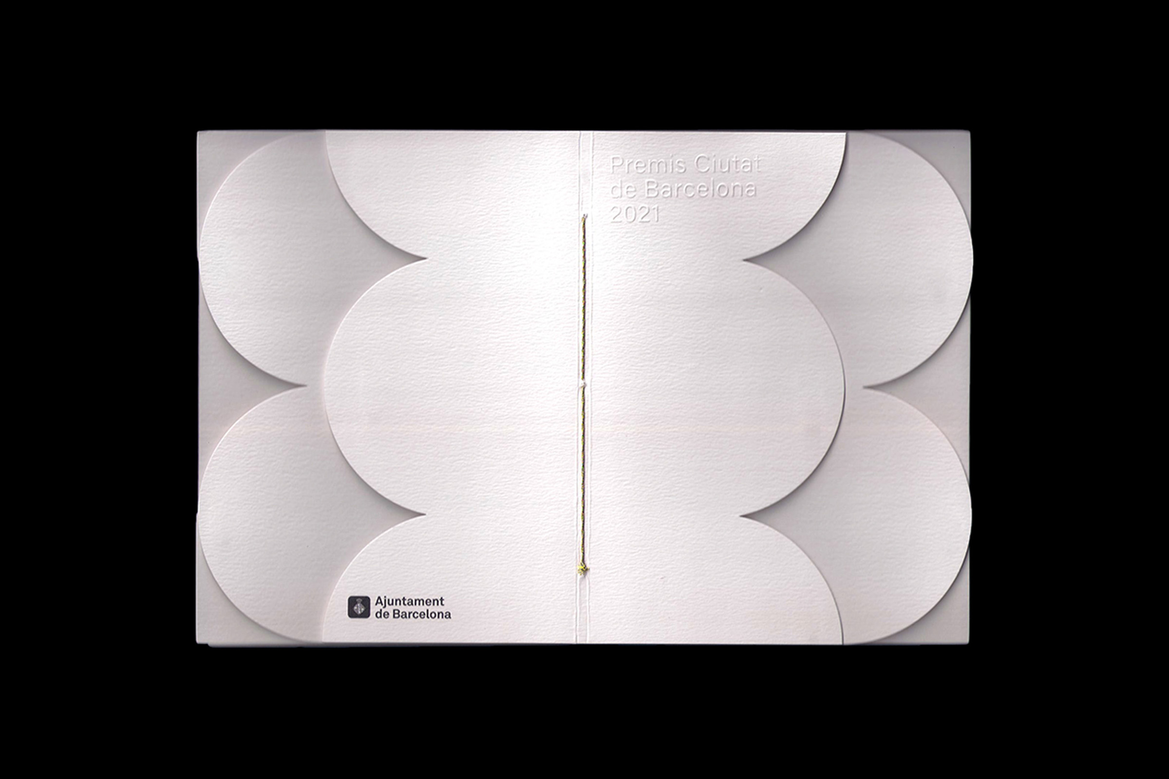
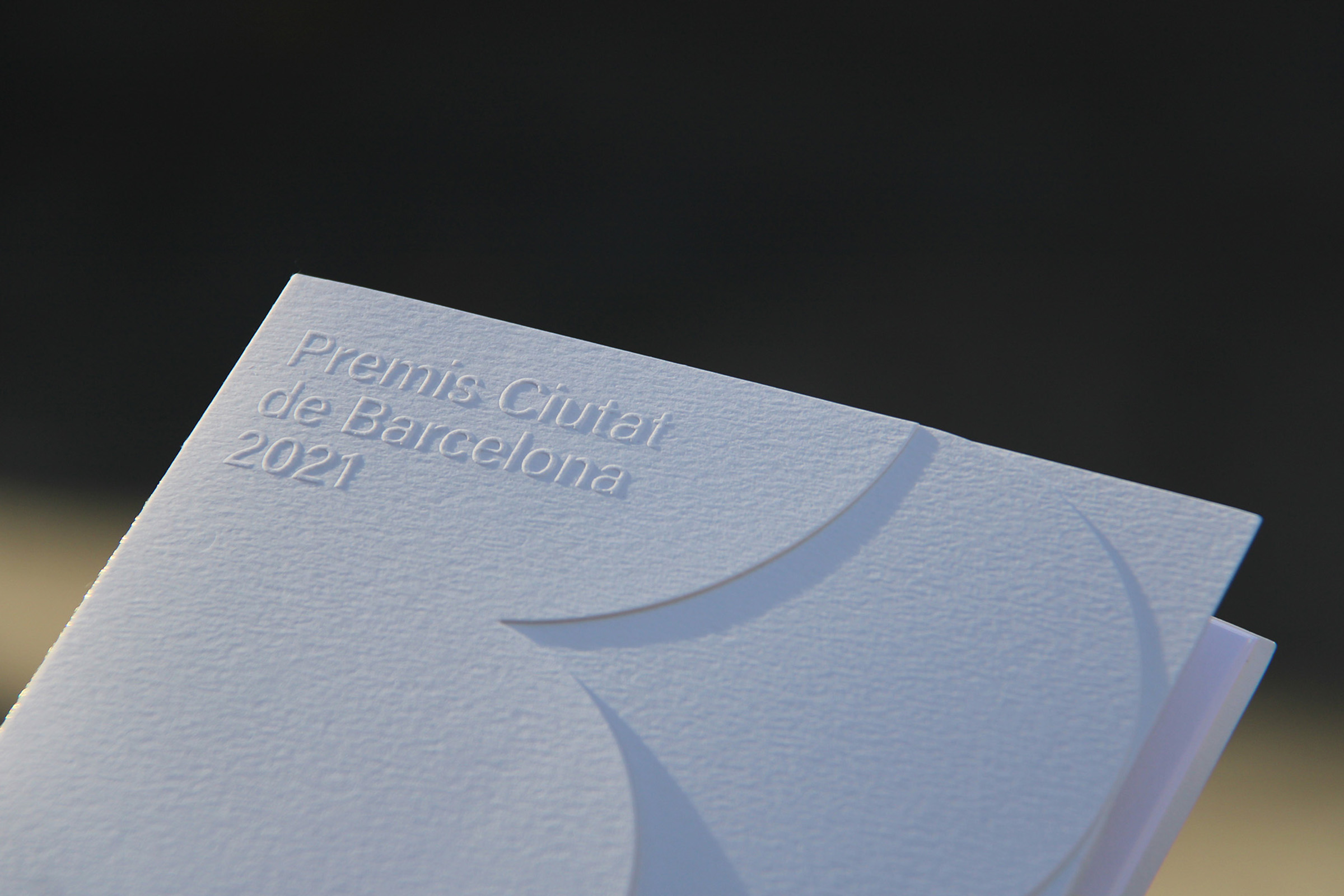
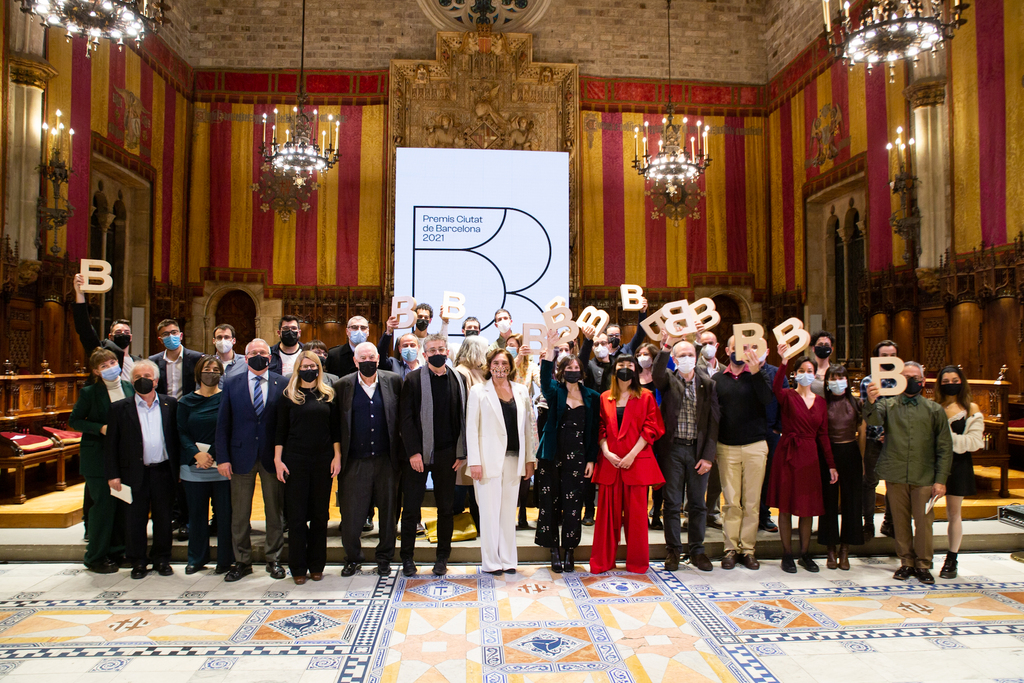
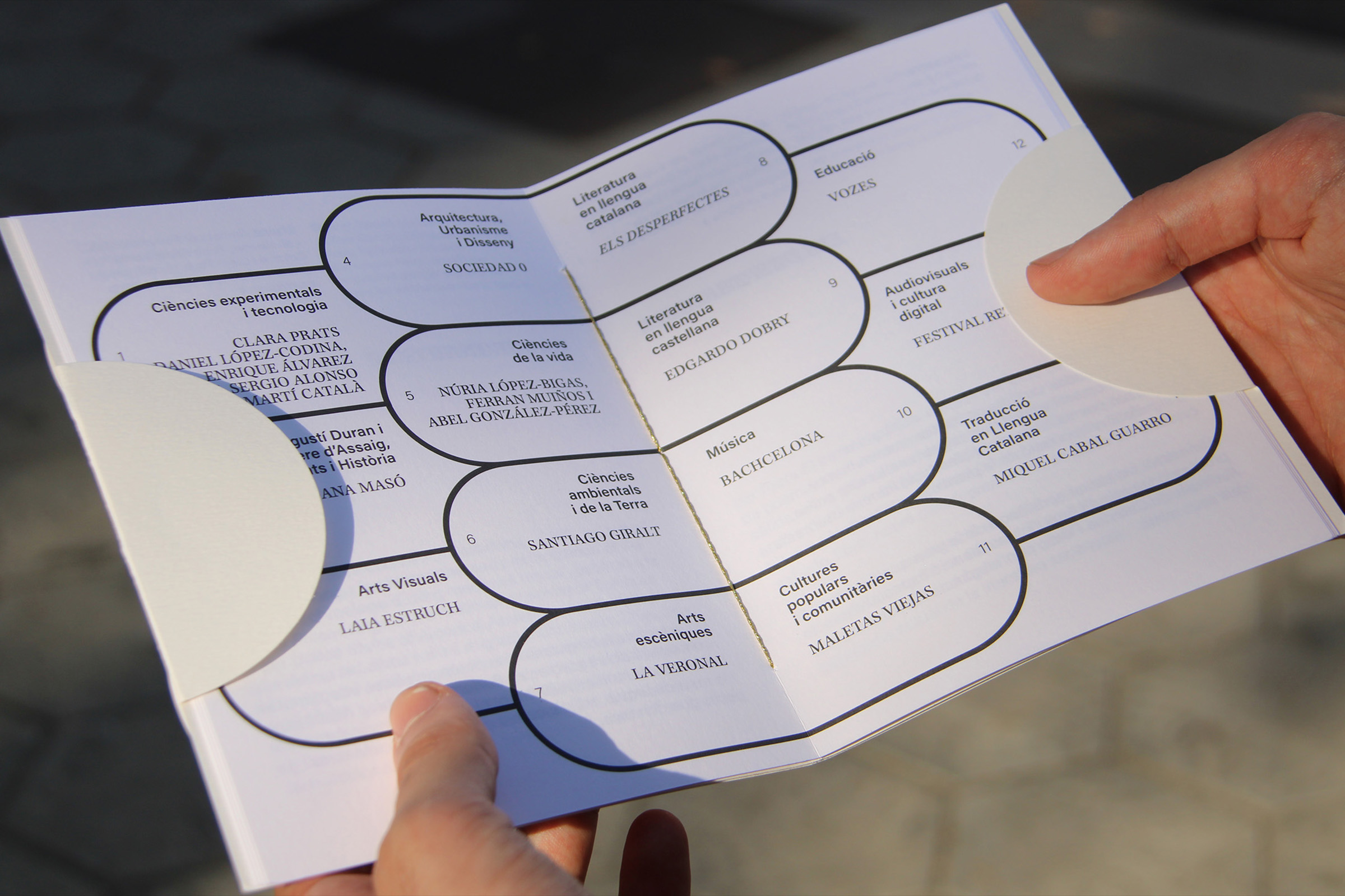
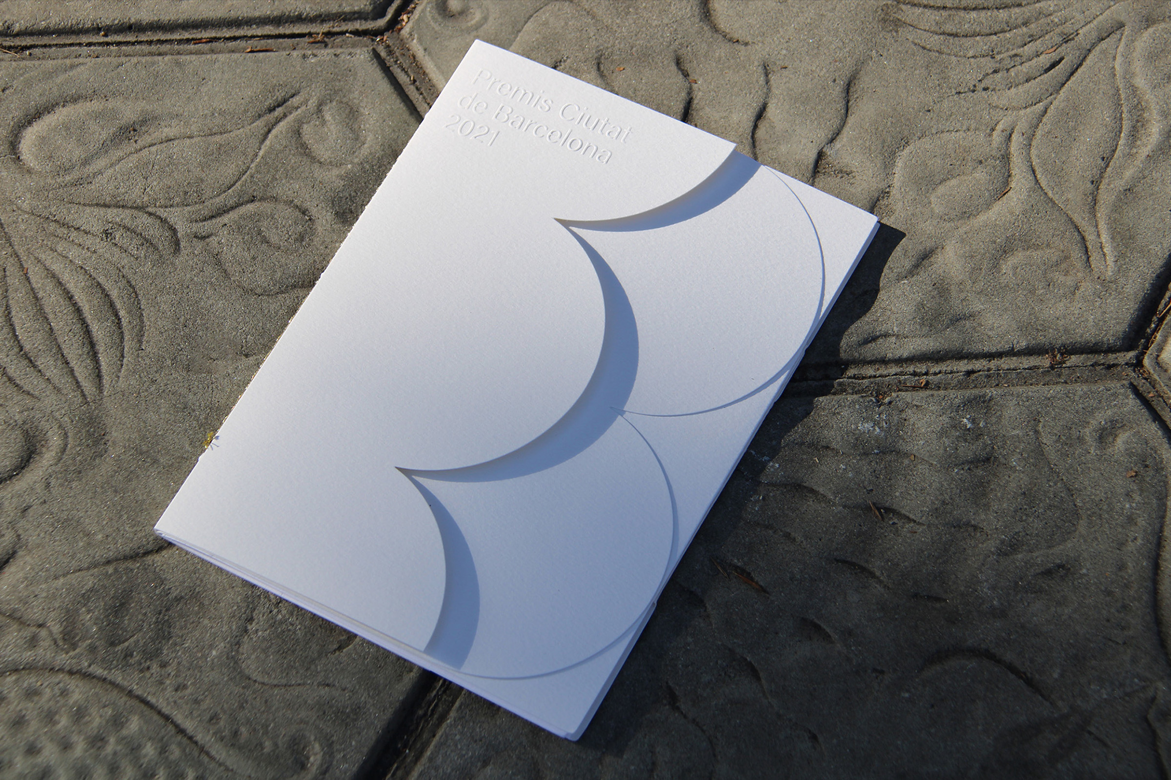
Premis Ciutat de Barcelona
Identity / Editorial
The Barcelona City Council annually calls for the City of Barcelona Awards with the aim of recognizing high-quality creation, research, and production carried out in Barcelona. Throughout its history, these awards have established their own identity using the letter "B."
Drawing an analogy between the scalloped tiles on buildings and the covers of books, a visual reference is created for the "B" in the awards. The final result is a completely white booklet where the "B" is formed by overlaying different layers, representing the protection of the 2021 edition.
Photography by Marti Viñuales @martivinyu


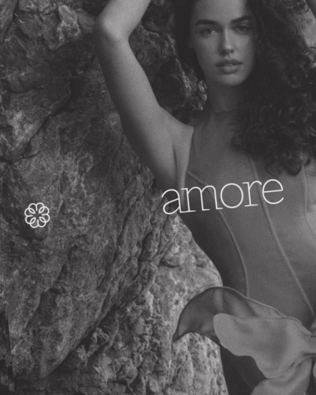
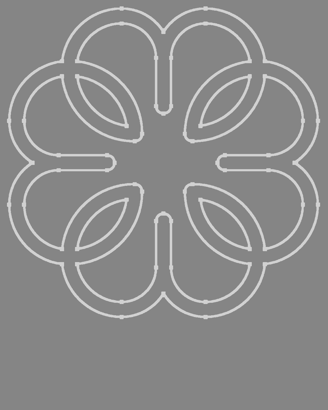


Amore
Identity
Amore is a discreet tribute to Barcelona’s modernist past. Its visual identity draws from the ornamental geometry of the panot—the mosaic we walk on every day, which conceals a story of craftsmanship and design. The project takes this graphic memory and reinterprets it with elegance and delicacy, offering a contemporary perspective.
Clean typography, balanced forms, and a refined color palette create a visual language that doesn’t shout, but leaves a mark. Amore not only communicates, but evokes detail, measured gestures, and the everyday beauty of the city.


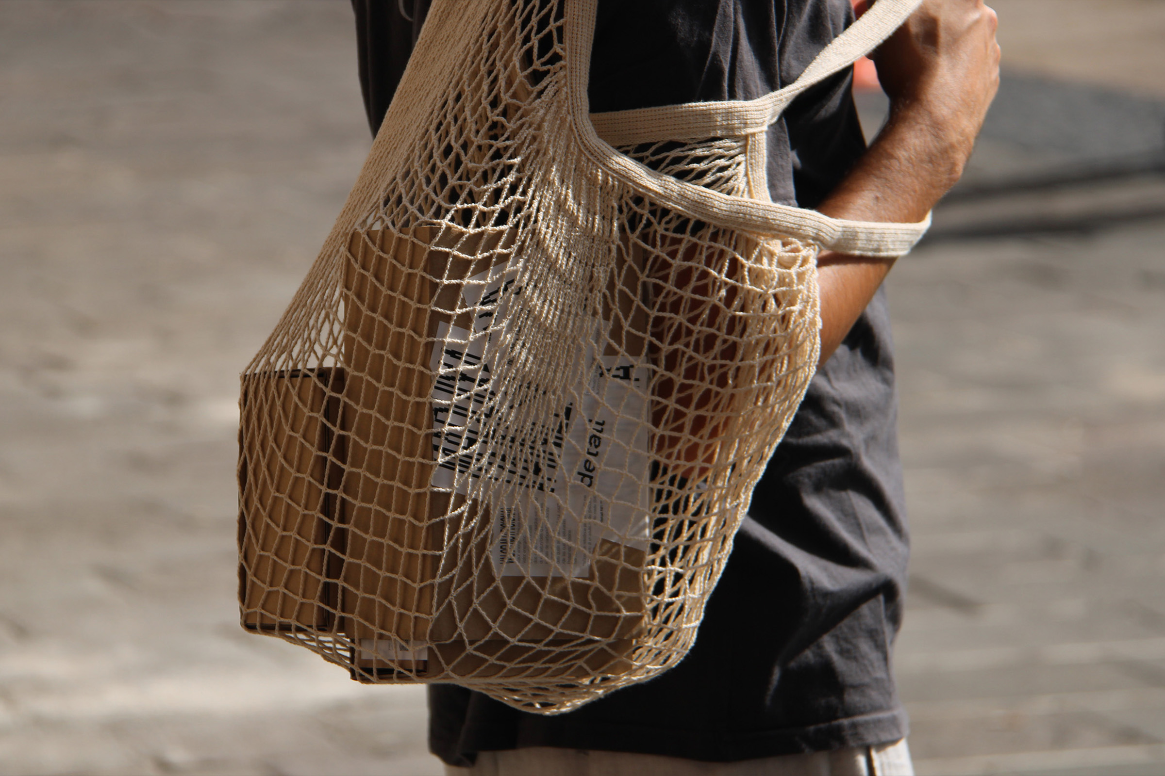
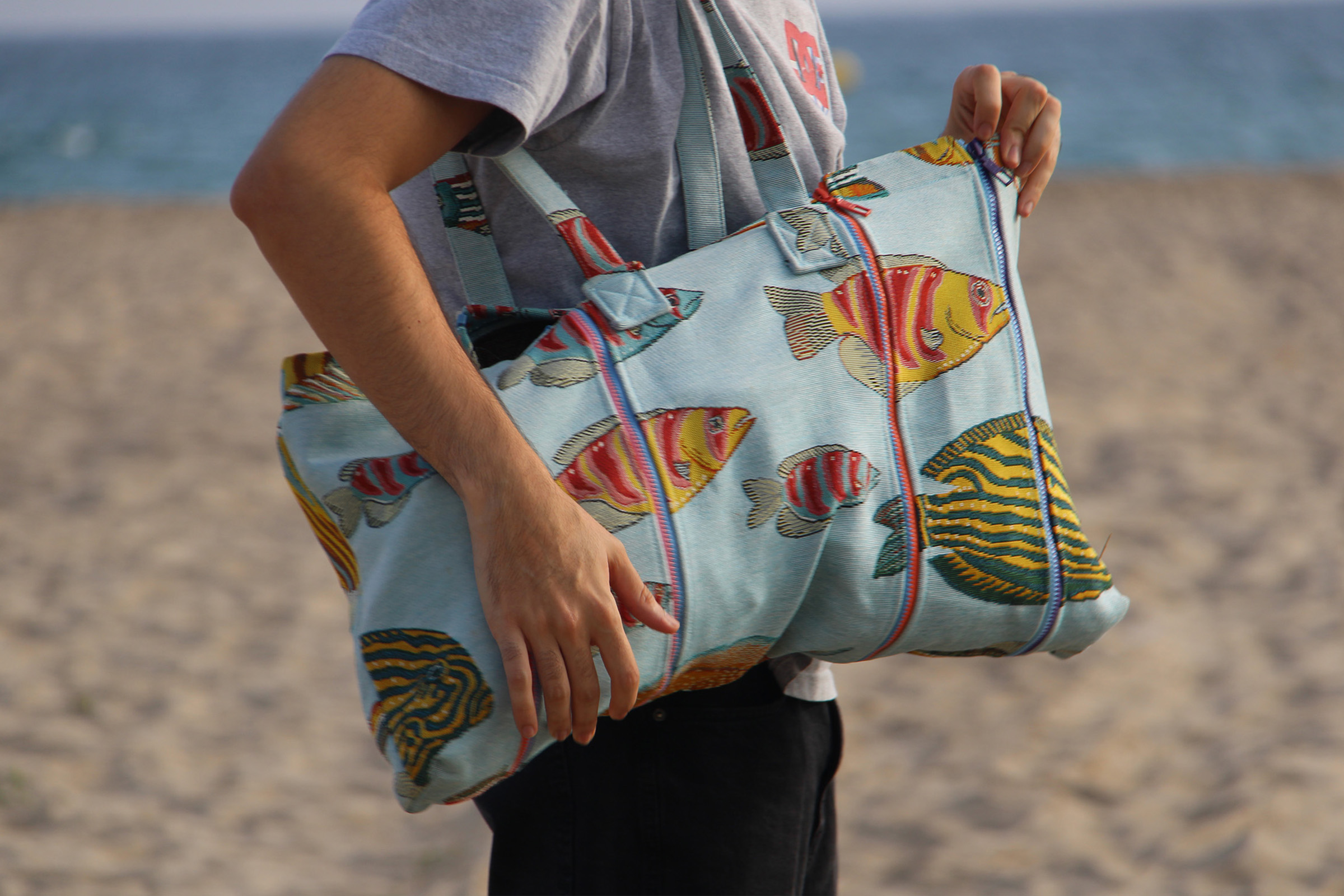
Valentina
Product
Expandable bag that allows you to adjust the storage capacity based on the user's needs by attaching panels that make up the bag.
Photography by Marti Viñuales @martivinyu


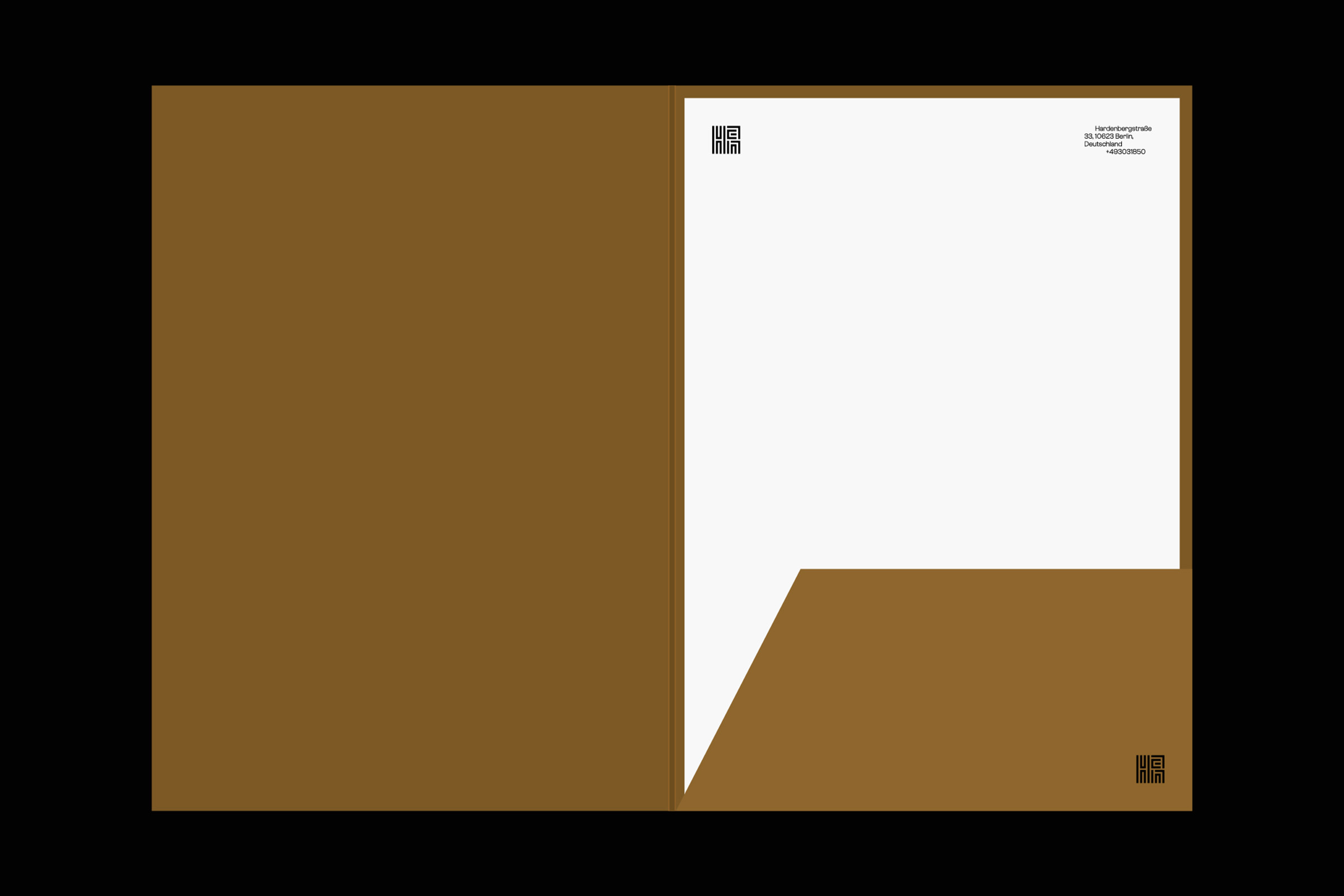
Detall
Identity / Packaging
Redesign of the block ice cream product, giving it a distinctive look and contextualizing it in the current world, a changed and dynamic world. To bring it back into modern context, creating a visual identity around the delivery service and a product strategy focused on user preferences.
Photography by Marti Viñuales @martivinyu


Han
Identity
Visual identity proposal for Byung-Chul Han, a South Korean philosopher and essayist. In order to uphold Han's philosophy of resisting the use of current technologies, the decision was made to use "Hangul" as a metaphor of analog and traditional.
Marc Pérez is a graphic designer based in Premià de Mar. Within the field of design, he is very interested in typography, editorial design, and identity design, although he also enjoys working on projects outside of these areas.
Experience
Freelance - Currently
Basora - Junior Designer
Ana Mirats Studio - Intern
Links
Instagram
Mail
Are.na
︎︎︎
Last update on September, 2025

Vora el Mar
Camapign / Editorial
During the past years, the Maresme coastline has been severely affected by the regression of its shores. The consequences are visible at first glance, with the deterioration of seaside promenadesand the disappearance of most beaches. The current proposals to regenerate the coasts are ineffective and costly, further harming the marine ecosystem.
"Vora el Mar" is an awareness and visibility campaign that highlights the situation experienced by the towns of Maresme. Through an immersive experience, it portrays the past, present, and future of the Catalan coast.


Premis Ciutat de Barcelona
Identity / Editorial
The Barcelona City Council annually calls for the City of Barcelona Awards with the aim of recognizing high-quality creation, research, and production carried out in Barcelona. Throughout its history, these awards have established their own identity using the letter "B."
Drawing an analogy between the scalloped tiles on buildings and the covers of books, a visual reference is created for the "B" in the awards. The final result is a completely white booklet where the "B" is formed by overlaying different layers, representing the protection of the 2021 edition.


Amore
Identity
Amore is a discreet tribute to Barcelona’s modernist past. Its visual identity draws from the ornamental geometry of the panot—the mosaic we walk on every day, which conceals a story of craftsmanship and design. The project takes this graphic memory and reinterprets it with elegance and delicacy, offering a contemporary perspective.
Clean typography, balanced forms, and a refined color palette create a visual language that doesn’t shout, but leaves a mark. Amore not only communicates, but evokes detail, measured gestures, and the everyday beauty of the city.


La Identidad Después de la Muerte
Editorial
Identity consists of unique and distinguishing traits that characterize us as individuals. It accompanies us from birth until death, but what happens to our identity once we depart from life?
"La Identitad Después de la Muerte" arises as a reflection on identity design applied to the tombstones. The book compiles the graphic style used in the past and how it has evolved to the present through photographs, in order to highlight the loss of identity due to the trend of serializing tombstones.


La Rosa dels Vents
Lettering / Packaging
Alella is a small municipality in Maresme surrounded by nature, with a long history linked to viticulture. Its landscapes are characterized by vineyards.
La Rosa dels Vents is born as a project to pay tribute to all the farmers and artisans dedicated to viticulture in Alella. It consists of a collection of three wines (white wine, rosé wine, and red wine) cultivated in the village's vineyards.
Photography by
Marti Viñuales @martivinyu
Marti Viñuales @martivinyu
![]()
![]()
![]()
![]()
Valentina
Product
Expandable bag that allows you to adjust the storage capacity based on the user's needs by attaching panels that make up the bag.
Photography by
Marti Viñuales @martivinyu
![]()
![]()
![]()
![]()
![]()
![]()
![]()


Valentina
Product
Expandable bag that allows you to adjust the storage capacity based on the user's needs by attaching panels that make up the bag.
Photography by
Marti Viñuales @martivinyu
Marti Viñuales @martivinyu


Detall
Identity / Editorial
Redesign of the block ice cream product, giving it a distinctive look and contextualizing it in the current world, a changed and dynamic world. To bring it back into modern context, creating a visual identity around the delivery service and a product strategy focused on user preferences.
Photography by
Marti Viñuales @martivinyu
Marti Viñuales @martivinyu


Han
Identity
Visual identity proposal for Byung-Chul Han, a South Korean philosopher and essayist. In order to uphold Han's philosophy of resisting the use of current technologies, the decision was made to use "Hangul" as a metaphor for the analog and the traditional world.
︎︎︎